If you've already come up with a great food truck name, then it's time to think about the logo! The logo is the heart of your business, making your brand recognizable among local customers, and should therefore stand out from the competition.
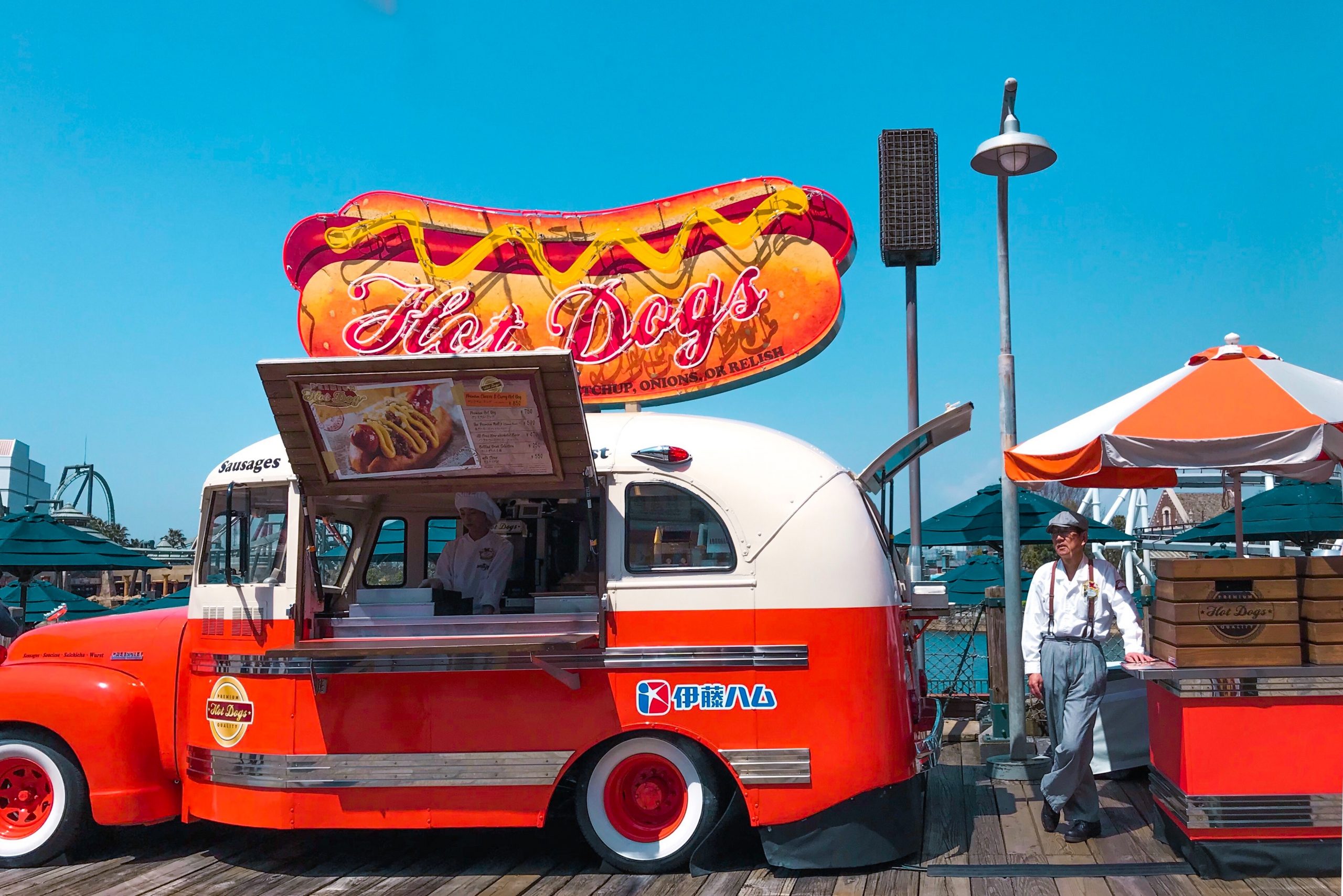
If you’ve already come up with a great food truck name, then it’s time to think about the logo! The logo is the heart of your business, making your brand recognizable among local customers, and should therefore stand out from the competition.
As with the name of your food truck, the logo should also reflect your offer (e.g. regional or international cuisine), your style and personality, and appeal to your target audience. You should spend as much time as necessary to make sure you achieve this. Remember that your logo will not only be on the food truck itself, but also on napkins, receipts, your business cards and, of course, on your website or on social networks. Decorative elements both on the outside and inside of your food truck should be based on the colors and design of your logo.
Making your food truck logo unique
Creating the logo yourself is more difficult than it may seem. If you plan to design your logo in Paint or any other free logo generator, then it’s probably better that you contact a design agency right away. You’ll find further tips and advice on this matter closer to the end of this article. Think twice before using programs like Gimp or Photoshop. Although ideal for improving images, they are not very good for designing logos. If you’re familiar with terms such as vector graphics, Illustrator, or Gravit, then you’ll probably find these tips for creating the best food truck logos particularly helpful:
1. Less means more!
Is a principle that has been voiced by architects, designers and artists since the beginning of the 20th century. This is also the case with logos, due to their bright colours, shapes, lines and clear font. A good logo should be easily recognizable, both as a small additional image and in its main form. It should speak for itself as a written trade-mark and be part of your food truck branding strategy. Adding too many details will not only distracts customers, but also make it difficult to use the logo in various sizes or with different background colours. This leads us on to another important piece of advice:
2. Be flexible!
You should design your logo in various formats, with not only the food truck itself in mind, but also napkins or social network profiles. You should start off by creating vector graphics. This format can easily be used for large printing templates, such as stickers or posters. The vector template can then be converted to other image formats for different websites or social networks. In the case of social media, the dimensions of posts and profile pictures should be taken into account. A round or square logo is usually better than a string of letters. Along with the colour logo, it is also worth creating a black and white version, e.g. for headings, receipts or napkins. Your logo should cover the following versions:
- four-colour prints (CMYK colours) and prints in non-standard colours (e.g. Pantone or RAL),
- displays (RGB colours),
- black and white prints,
- large and small formats,
- horizontal and vertical formats for square logos.
In the case of all the above-mentioned versions, the logo should be clearly recognizable, and above all, it should catch the eye!
3. The choice of colour
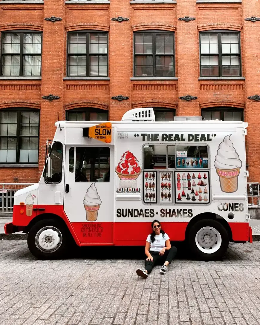
Colour schemes require in-depth analysis. The human mind treats each colour differently, which should be taken into account. Each colour carries positive or negative connotations. In general, you’ll find that:
- Red attracts attention, but also suggests danger.
- Orange stands for joy and energy, but is often associated with cheap products.
- Yellow is the brightest of all colors and stands for both optimism and envy.
- Green is relaxing and feels natural, but is also associated with immaturity.
- Blue is calm and soothing, but also has a cold and impersonal feel.
- Violet suggests creativity and originality, but is an unnatural colour.
- Black is elegant and neutral, but also sad.
- White stands for purity and innocence, but is also rather cold and sterile.
Yellow, orange and red are generally warm colours. Blue, on the other hand, is considered rather a cold colour. If the menu is limited to a given culture, region or country, the logo could also include colours of the national flag, if they are associated with the given cuisine. However, remember that your competition may have already come up with the same idea.
4. Minimalism or extravagance – that is the question
The logo should always match your type of business. Therefore it’s not necessarily a good idea to get inspired e.g. by great taco truck logos if that’s not your offer, or to use cheap design generators – unless you really are on a very tight budget. Other food truck logo design ideas can be used as inspiration, but remember to be original when planning your own logo. Your goal is not to re-invent the wheel, but stick to some proven rules:
- Contrasts create tension.
- “Closed” shapes are much easier to remember.
- Symmetrical designs give a feeling of tranquility and have positive connotations.
- Logos with similarly-sized, proportionally laid out elements usually work best.
- The empty spaces between the letters will draw your attention to the most important details of the logo.
Extravagant or expressive logos will be more appropriate for modern and unconventional food trucks, while standard colours and shapes will work better with traditional cuisine.
5. Timelessly beautiful
The logo should be your trademark for many years to come, so don’t get too inspired by current trends. For example, don’t use the colour of petrol just because it’s fashionable at the moment. Don’t follow trends blindly, even if many logos only have one letter! You should not use different shades of one colour when designing a logo, while gold or copper geometric elements will usually only be fashionable for one season. Handwritten letters looks nice, but are difficult to read.
The logo should look modern, but remember not to follow every new trend you see.
If you still feel that designing a logo yourself is too difficult, then maybe you should reach out to a professional for help.
Designing a food truck logo – what methods and costs should you take into account?
A professional logo design will usually cost between 200 and 1000 GBP. Below is what you should expect in return for your investment:
- The cheapest option is designing the logo yourself using an appropriate program. A logo designed this way will rarely give a satisfying effect, and is unlikely to fully match your food truck. You should only consider this option if you are on a very tight budget.
- Working with a freelancer is a bit more expensive, but not totally out of reach. You can find freelancers by browsing a search engine or portals such as freelancer.com. This option is good if you already know more or less what you want your logo to look like. You can also find a suitable offer browsing through designers’ portfolios.
- Another way to find interesting ideas is a competition for designing your logo. This is a good idea if you don’t have a clue what your food truck logo should look like. This is also quite a cheap and favourable option in this case.
- The most expensive, but at the same time effective and convenient option, is approaching a design agency. Such agencies will not only propose several designs, but also various sketches for different types of use. You can then choose a few of your favorite designs from among all those presented, and also expect support with legal and corporate identity issues.
Watch our channel for further tips and information about the food & beverage industry.



Share